Logos.
We see them all day, every day, everywhere we go. They do everything from influence our purchasing decisions to help us find the nearest Taco Bell when a craving hits. Logos are an integral part of our lives, yet somehow they’re one of the first things a business is willing to skimp on…and we can’t blame them!
When you have a skill or talent that you believe in so much that you’re willing to offer it to the rest of the world, you probably spend most of your time perfecting whatever that is. By the time you’ve created a business plan, secured a space to operate from, hired employees and set up shop, who has time to sit down and think about how to summarize what you do in one little image?
Well, we do.
Shapes, negative space, balance, readability, relevance, uniqueness, longevity, color theory, versatility and emotional responses are just a handful of things we consider throughout the logo design process. It’s easy for someone to look at a professional logo, especially a simple one, and think “Eh, I could do that.” But the fact is, it’s often the simplest ones that required the most work.
Take Hulu, for example.

At first glance, it might seem like they just grabbed a techy font, slapped a gradient on it and called it good. Upon closer inspection, however you’ll notice that only 2 shapes are used in the whole thing. The “h” is actually a combination of the “u” and “l”, flipped upside down. Genius! Little details like this are what you pay folks like us to consider. Are most people going to notice this little fun fact? No, probably not. But the repeating shapes create a visual that is both memorable and easy on the eyes, and that is something that people will notice.
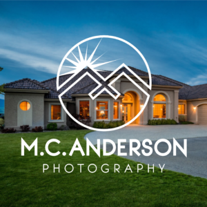
Another issue folks run into with logos is wanting to portray so many different aspects of their business, they end up with a cluttered mess. Consider this logo we designed for M.C. Anderson Photography.

Matt needed a logo that simultaneously represented what he offered (high-end real estate photography) while not distracting from his photos. He wanted it to encompass the Lake Chelan Valley without pigeon-holing himself to one locale, and also needed it to represent the techy nature of his skills (like his fancy drone or the sweet robot camera that lets you “walk” through a house online. So. Cool.)
So how did we combine real estate, scenery, Lake Chelan but-also-other-places, high-end, photography, robots, AND Matt’s personal aesthetic without creating a Picaso-esque mess??
Dual purpose, baby.
If you look closely you’ll see an “M” for M.C., mountains, roof peaks, a bird, the sun, a lens flare, a circle, a camera lense, and crisp, clean angles that say I know what I’m doing + I have sweet tools to do it. We kept it clean and simple while still communicating all the things Matt needed to put his business in the best light, pun intended.
You can’t get that on Fiverr y’all.
