Amber came to us with a unique challenge: She needed a logo for her co-op space that would not only stand alone, but also serve as a home for several other businesses with branding of their own.
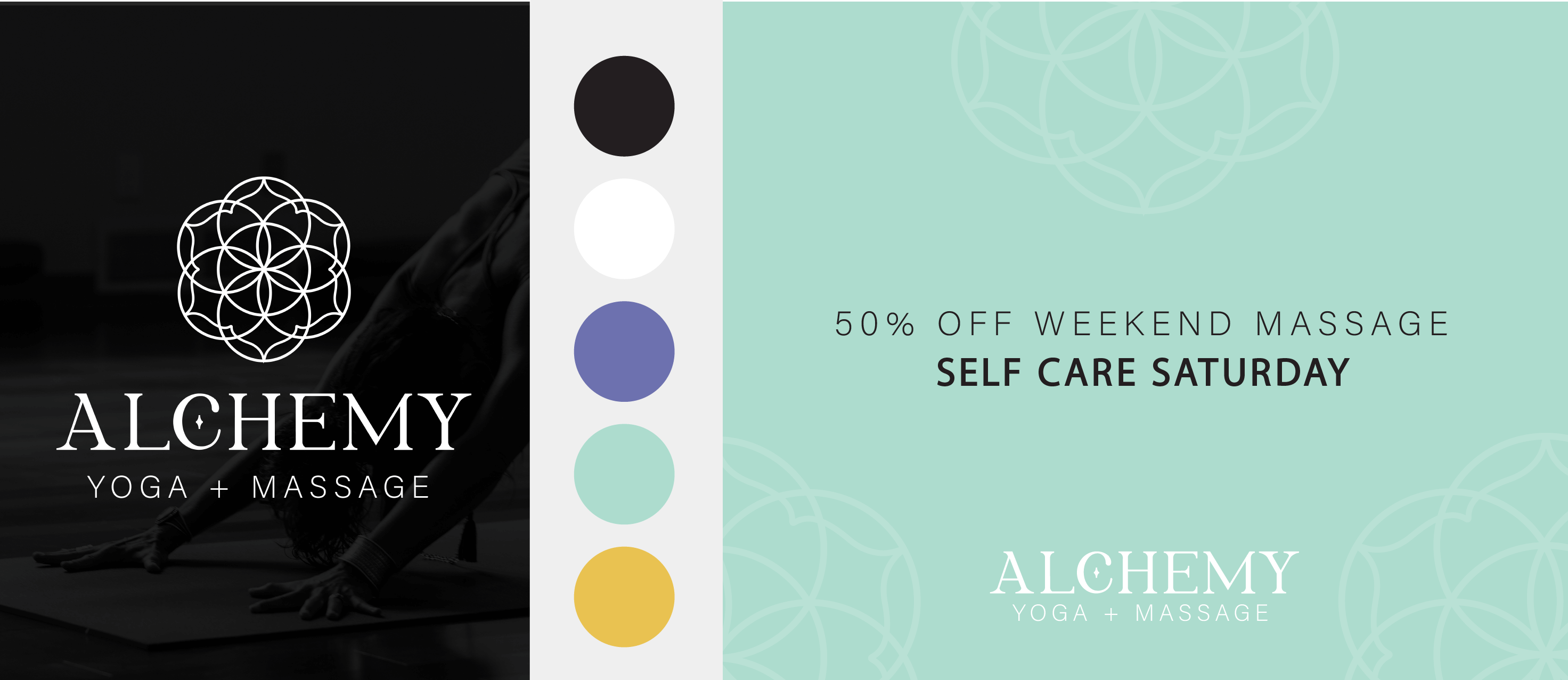
We set out to create a logo that was both bold and holistic, featuring sacred geometry and a sprinkle of the magic of alchemy. Amber provided us with a quote for inspiration, and a ton of creative freedom!
" Alchemy... the process of taking something ordinary and turning into something extraordinary, sometimes in a way that cannot be explained." – unknown

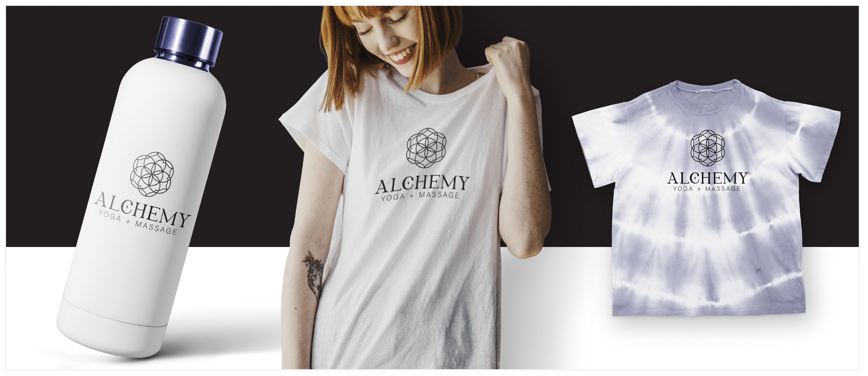
We decided to go with a classic black and white for the primary brand colors so it would pair well with other logos, but also provided a color palette that Amber can use in her digital and printed collateral.

The secret sauce for this project is that Amber had a clear vision and also allowed us enough creative freedom to use our design skills at their full potential.
We think our girl Kat knocked this one out of the park!

