1. TWO "FUN" FONTS TOGETHER
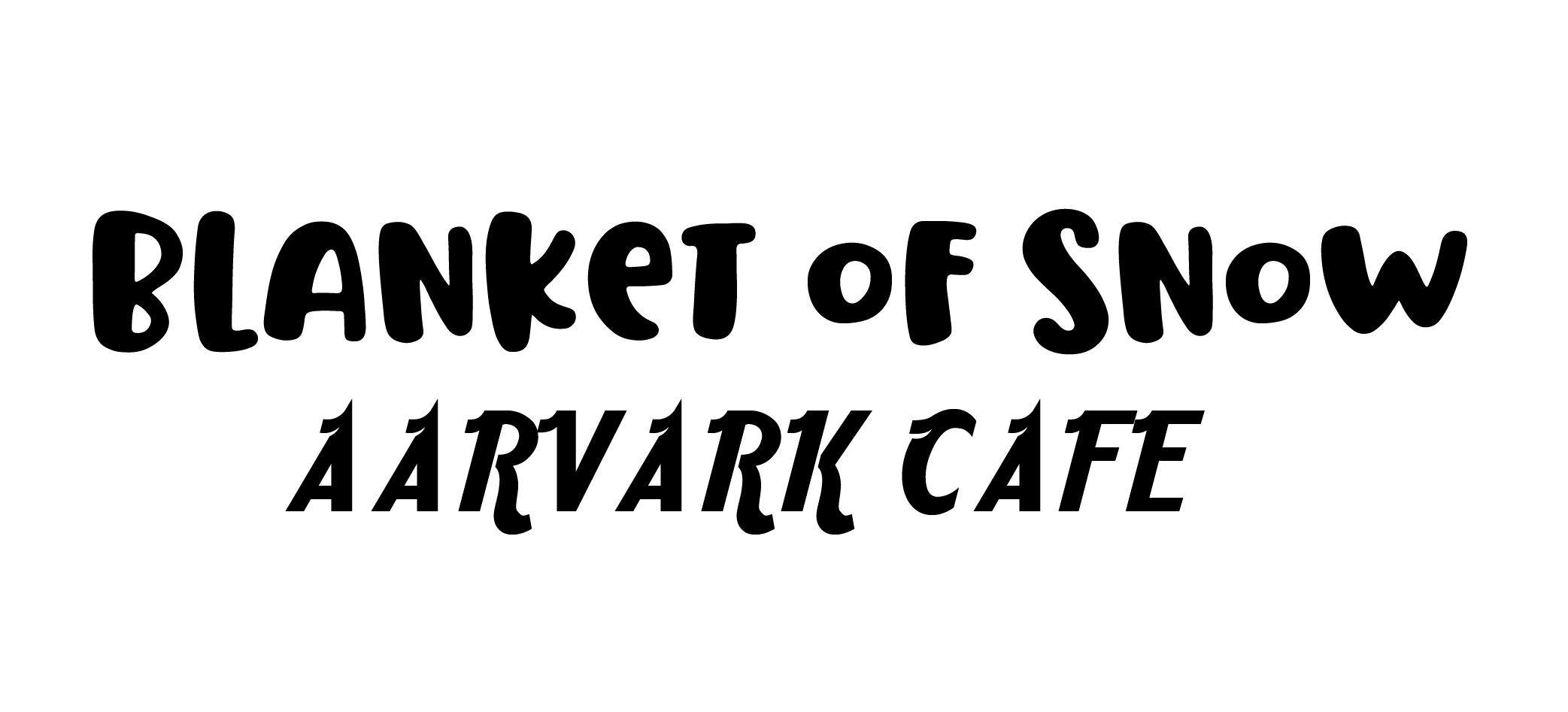
OoOoOo, scary! Either font would be great on it's own, but when paired together, they compete for attention and there's no clear winner.
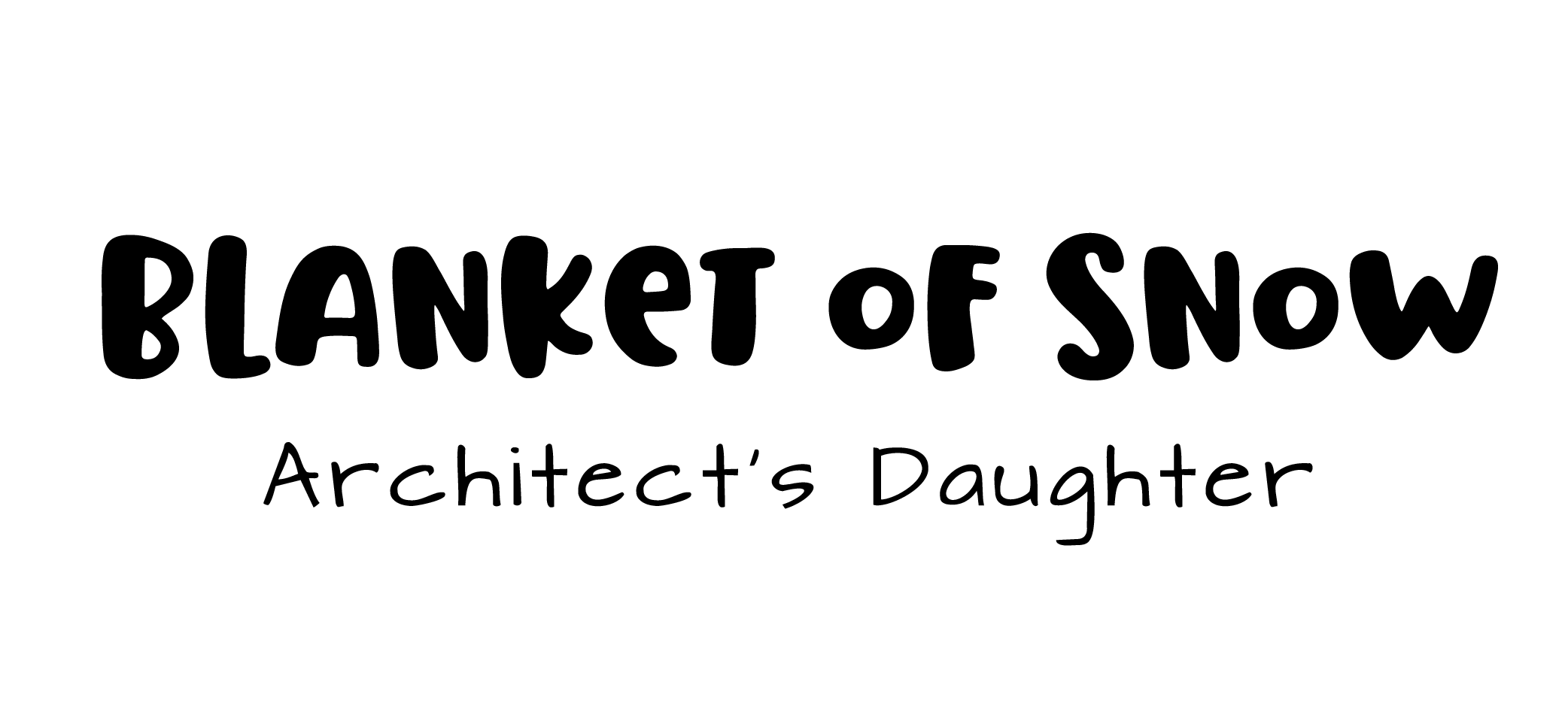
This pairing retains the fun factor, but allows the headline to shine as the first thing the eye goes to.
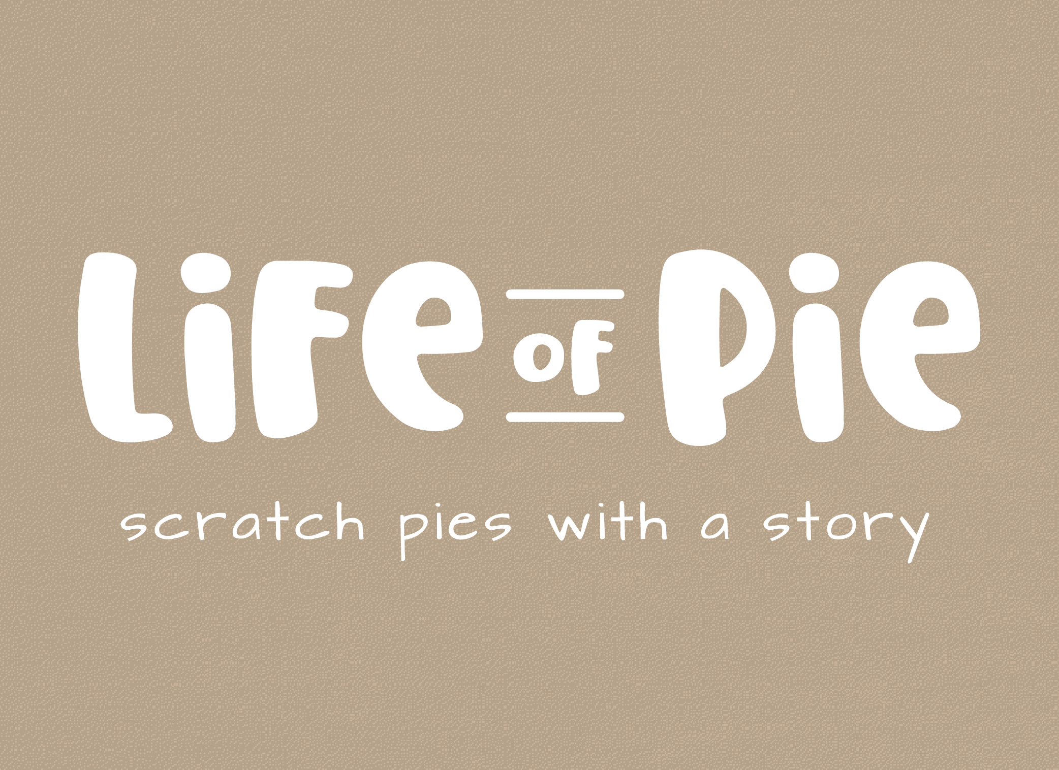
The final result in action!
2. TWO DIFFERENT SCRIPTS
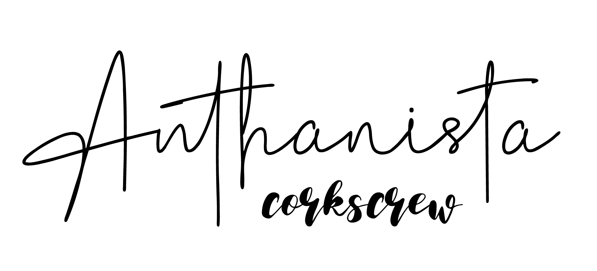
OoOoOo, scary! True: People love script fonts. False: The more the merrier. Nope! In this case, two different scripts are giving "chaos" instead of "class".
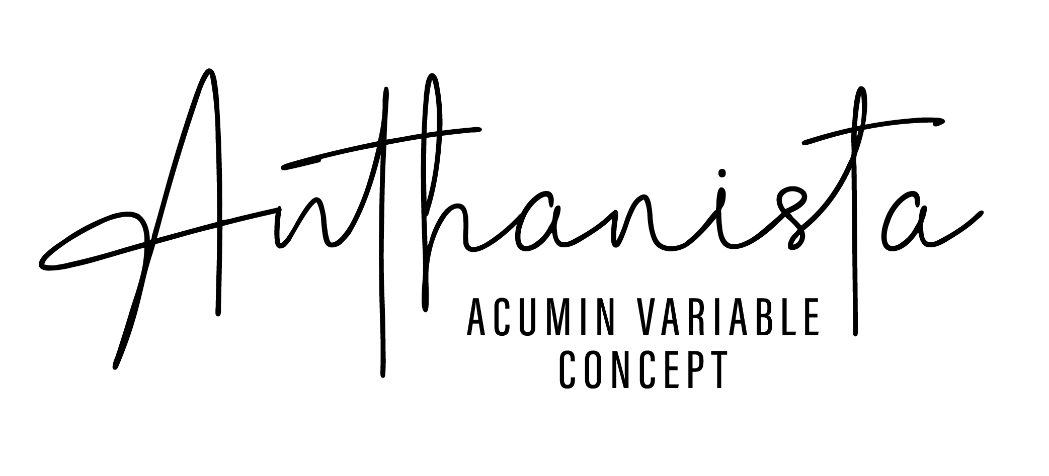
Using a script in a marketing application is already a little risky, so it's best to play it safe with a very simple, legible secondary font.
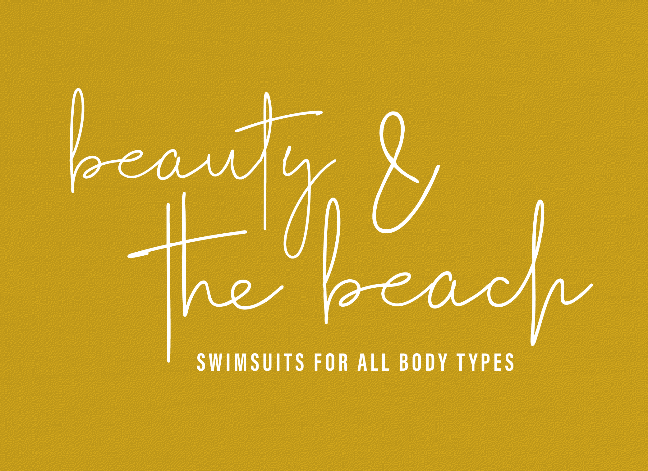
The final result in action!
3. TWO DIFFERENT THEMES
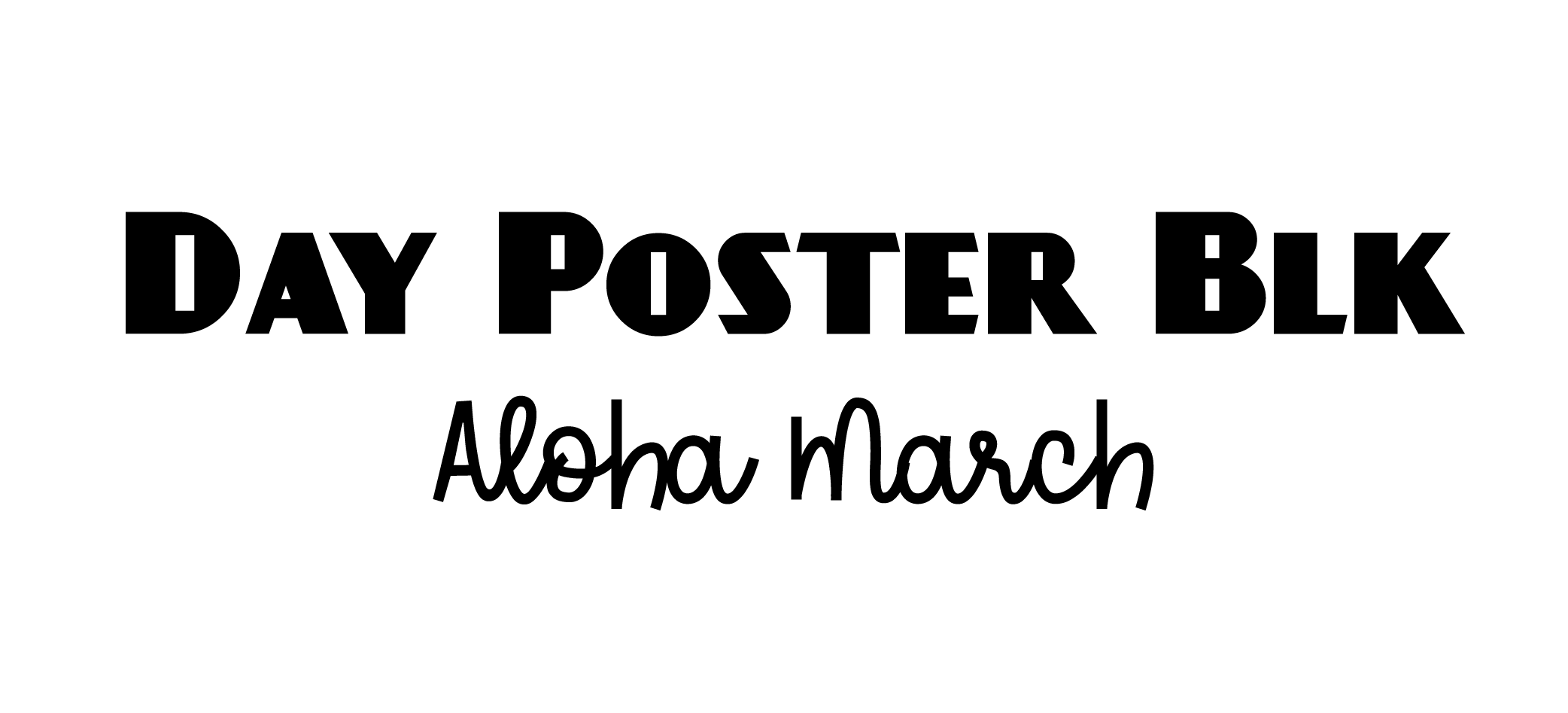
OoOoOo, scary! This pairing is having an identity crisis. Unless your business is a speakeasy luau, this duo is clashing in a big way.
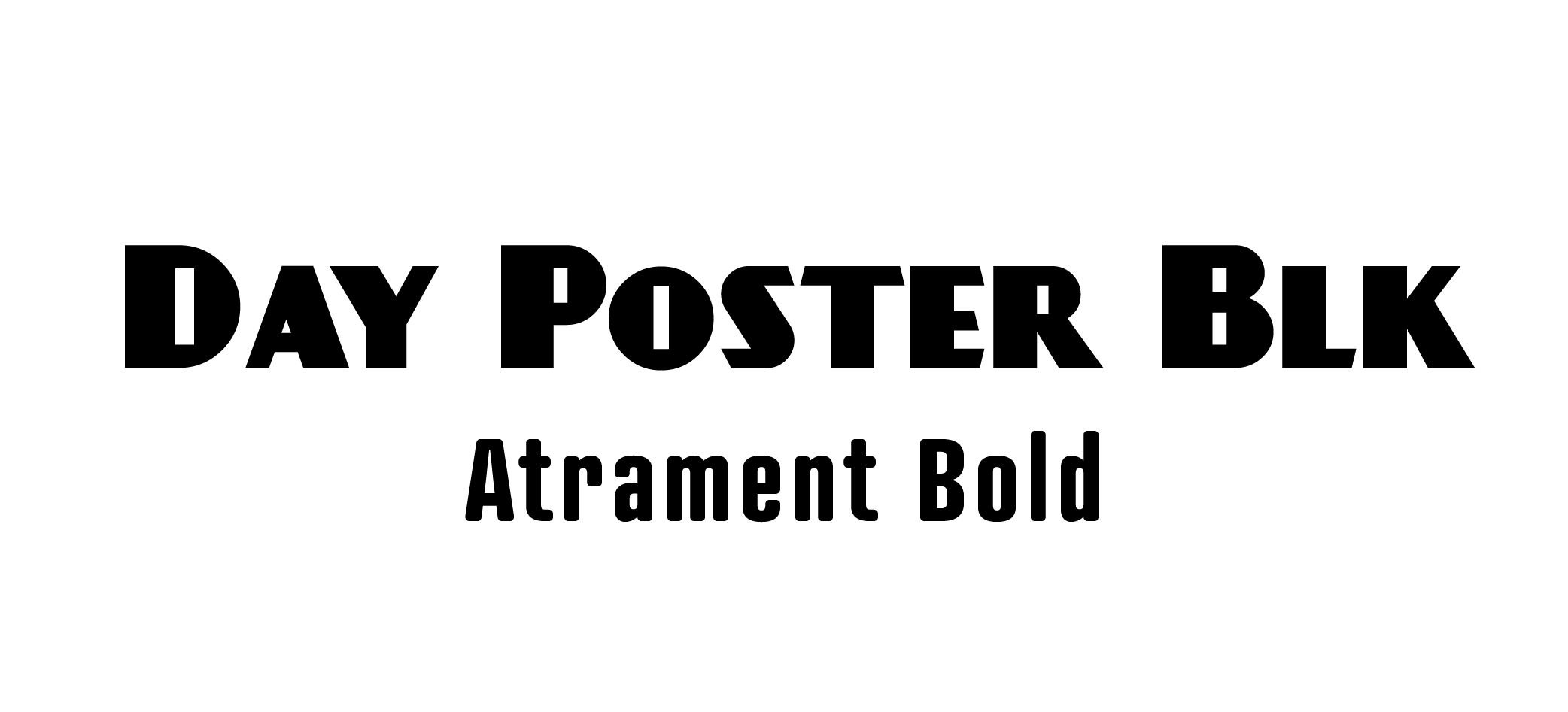
Pairing display fonts with a strong theme can be tricky, especially if your brand isn't overtly themed. In this case, try an equally strong-yet-neutral secondary font.

The final result in action!
4. SAME SAME BUT DIFFERENT
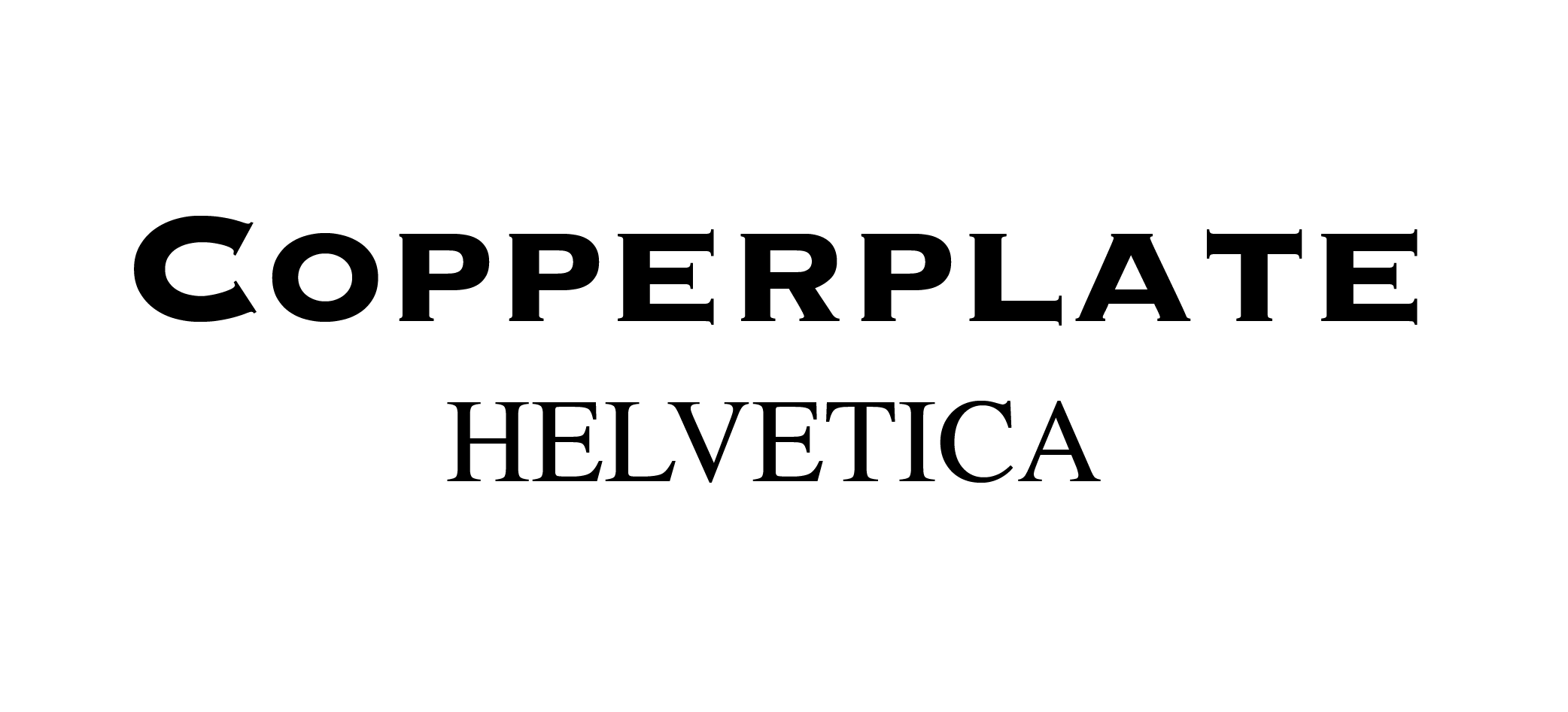
OoOoOo, scary! We're so glad serifs are making a comeback, but since the difference between them can be subtle yet unsettling, it's best not to pair more than one together.
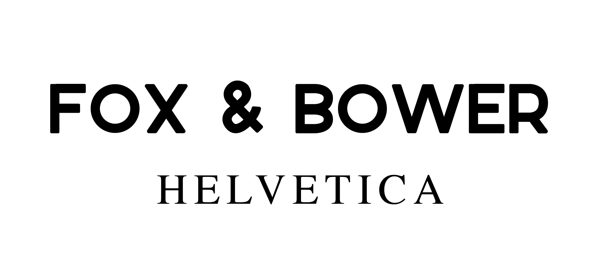
Serif fonts can make a headline extra readable and punchy without distracting from the display font.

The final result in action!
5. TWO BOLD = TOO BOLD
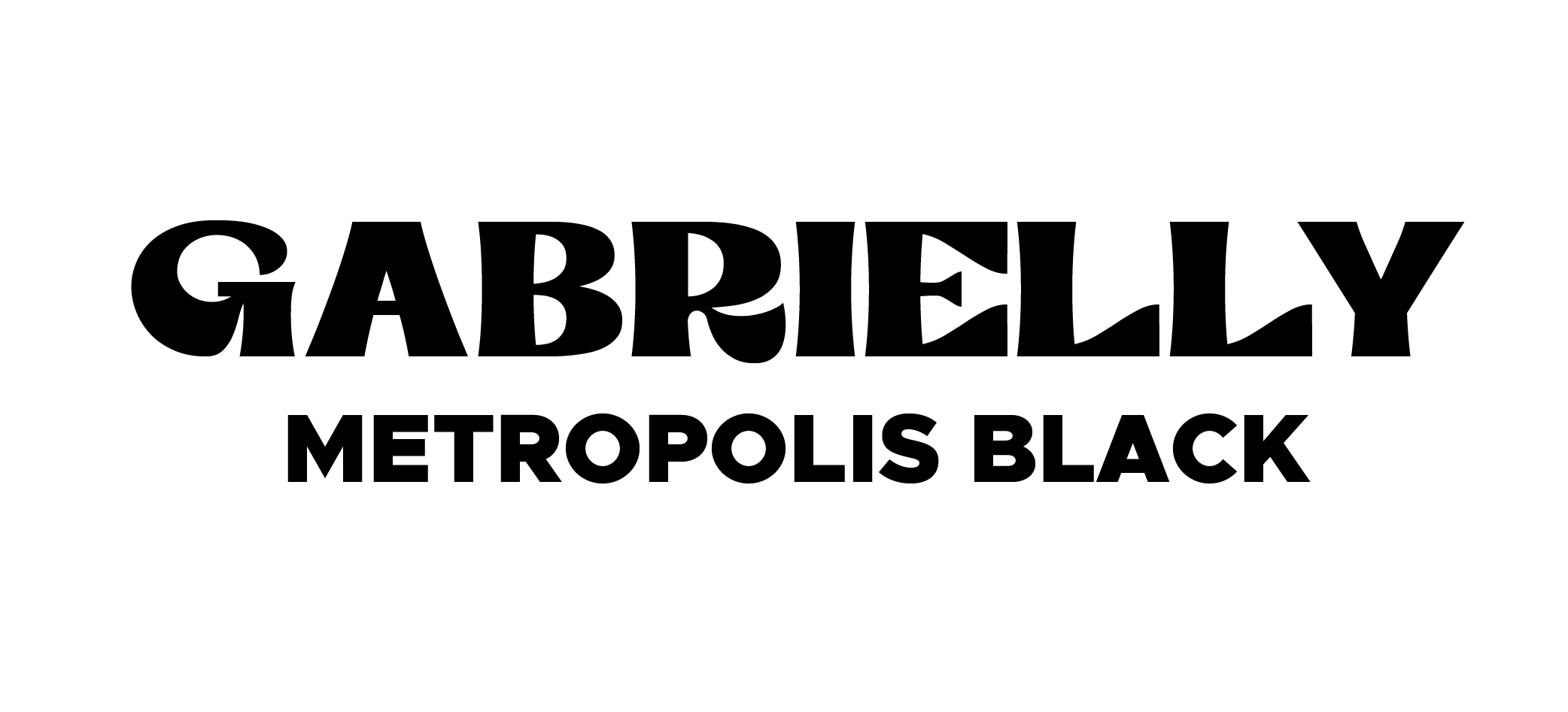
OoOoOo, scary! When all fonts are the same thickness, the eye gets confused about which information is the most important.
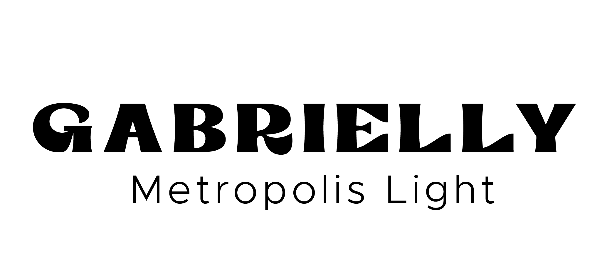
The same font in a lighter weight makes all the difference!
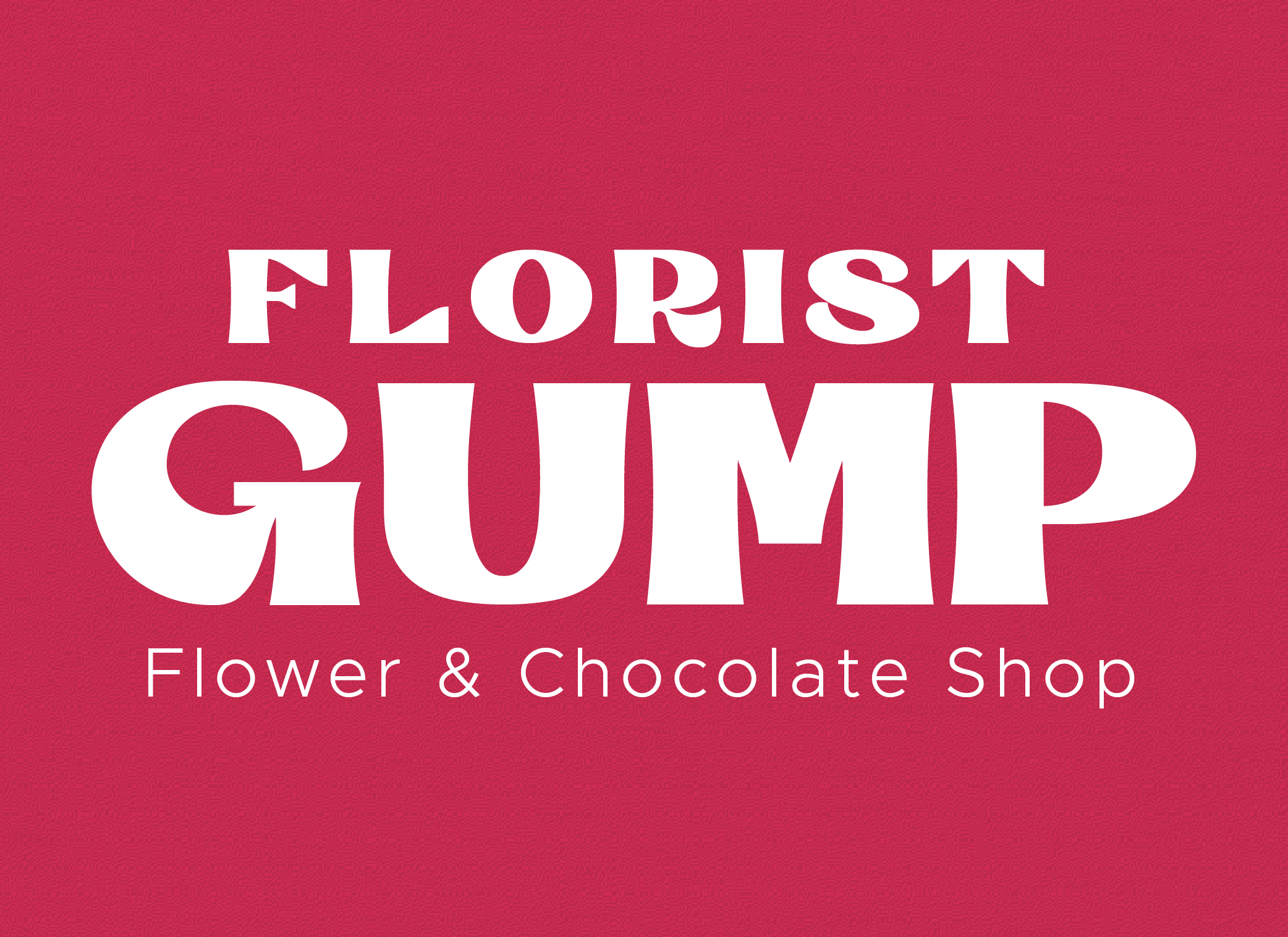
The final result in action!
