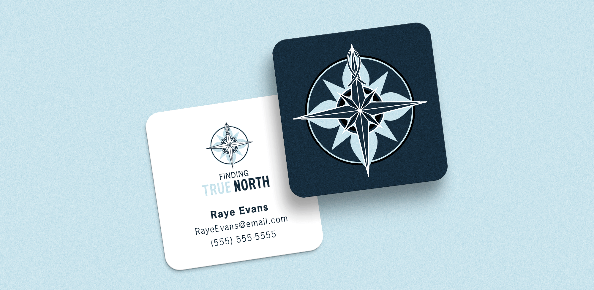

Every once in awhile a client comes along who we'd love to clone a thousand times over (e.g. Raye) so you can imagine our excitement when she told us about her new entrepreneurial adventure!
One of the primary challenges is that her brand, True North, had several branches and each one needed a logo that would serve each branch individually while representing the True North brand as a whole. Raye had a clear idea of the imagery she wanted to include, which made our brainstorming phase a piece of cake. After filling out our handy dandy online logo questionnaire, we were able to jump right in with a round of initial ideas. The first steps of the logo design process vary from client to client, but since Raye knew she wanted both a compass rose and a Christian fish involved in the design, we started by trying out a few different styles to see what struck her fancy.

The bottom left was the clear winner! She had some ideas for different color palettes, all with a similar theme — earthy and nature-inspired. The next round consisted of different combos of fonts and colors before eventually narrowing it down to two solid options.

Raye decided on the blue palette, which happened to be our favorite as well! Last but not least, we made a plan for how to apply the overall branding to each branch. Because 3/4 were somewhat related, we chose to make the rental logo stand out more from the rest.

In the end, we provided Raye with a complete set of logos for each branch, as well as a business card design, a one-page Canva template and a branded Google form for her incoming clients. Here's what she had to say about her experience with us:
"LCCM was the perfect balance between supporting my technical shortcomings and listening to my heart. I will choose them again and again. Blessed!" - Raye Evans, True North LLC