The Challenge
Advance Northwest approached us with a challenge: their existing logo wasn’t reflecting their true identity. As an organization deeply rooted in the North Central Washington community, Advance’s previous logo didn’t adequately express their mission of empowering individuals and fostering growth. They needed a visual representation that captured their community-driven values, commitment to progress, and connection to the beautiful valleys and hills that define the region.

The Solution
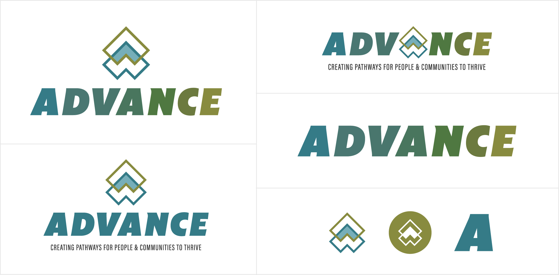
We set out to design a logo that would speak to Advance's core mission: to support, uplift, and help individuals grow. The result? A logo that visually embodies movement, progress, and the unique landscape of North Central Washington.
Logo Concept and Symbolism
The new logo is built on clean, layered geometric shapes that overlap and move upwards, symbolizing growth, direction, and possibility. The arrows pointing skyward represent the upward journey that Advance inspires for those it serves — guiding individuals toward new opportunities and a brighter future. At a glance, the overlapping arrows convey a sense of motion and progress, which aligns perfectly with Advance’s dedication to fostering positive change.
These geometric shapes are not just symbolic of the organization’s mission but are also reminiscent of the iconic hills and valleys that define the North Central Washington region. This subtle nod to the landscape grounds the organization in its community, creating a strong sense of place.

Color Palette: A Deepened Visual Story
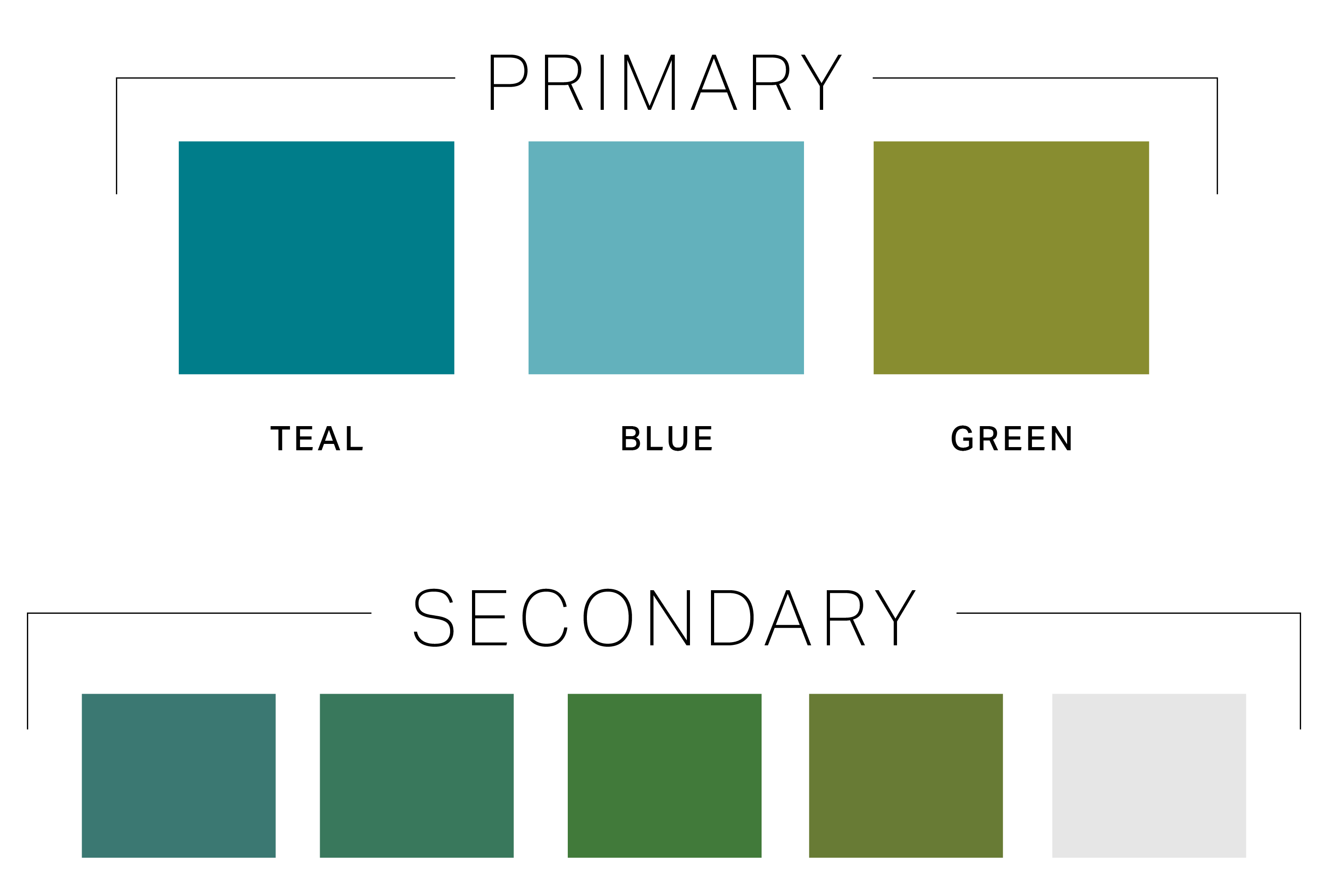
The color palette plays a significant role in reinforcing Advance’s mission and values. The teal and green hues work together to tell a rich, layered story:
- Teal: The calming, inviting hue of teal reflects the stability, trust, and approachability that are central to Advance’s mission. Teal encourages a sense of calm and reassurance, aligning with the organization’s role as a trusted partner to those they serve.
- Green: Symbolizing renewal, growth, and life, the green color brings a sense of fresh opportunities and new beginnings. It mirrors the positive impact Advance has on its community, helping individuals reach their full potential by offering support, resources, and opportunities for change.
Together, teal, green and blue represent both the natural beauty of North Central Washington and Advance’s commitment to uplifting its community. The colors reinforce the organization's focus on growth, stability, and positive transformation.

Typography
We chose a font that is slightly italicized to symbolize forward motion, giving the entire logo a dynamic and active vibe.

The Impact
The redesigned logo not only reflects Advance’s mission but also enhances its brand identity in a way that resonates deeply with the community it serves. With a logo that embodies movement, growth, and connection to the region, Advance now has a visual symbol that truly speaks to its values and its role in the lives of those it helps.

This logo redesign has provided Advance with a fresh, cohesive brand presence that is both modern and meaningful. It stands as a visual testament to the organization’s ongoing commitment to guiding individuals on their journey toward a brighter, more fulfilled future.
Here's what they had to say about their new logo:
"The team at LC Creative Marketing took the time to get to know our organization, understand our mission and the passion that drives our teams. They internalized our innovative approaches to social service and created a logo that our teams are proud of. The graphics and font capture the essence of our approach to supporting the communities we serve. They were thoughtful with color scheme and created something that is approachable across generations, but remains contemporary. I can't say enough about how quickly they were willing to move forward with our project and how receptive they were to feedback during the process. We look forward to using their services again! Knowledgeable, honest, kind, passionate and innovative...all the things you need in a marketing partner!" - Aliya Quidwai, Director of Operations

Onward & Upward
The new Advance logo is a perfect reflection of the organization's core values: growth, direction, and community. By incorporating symbolism that speaks to both the landscape and the mission, we’ve helped Advance build a strong visual foundation that will continue to inspire and connect with its community for years to come.
