One of our responsibilities as a marketing company is to keep up with the ever-changing trends in social media, websites, graphic design and our global and local social climates. It’s normal for us to look critically at our visuals on a regular basis and update them as needed, but we understand that this isn’t the case for everyone else. It can be time consuming and expensive to redesign your logo, making it easy to tell yourself that it’s “just fine” as-is. We’ve rounded up some of our favorite before and after’s of famous logos to show you how your own brand could be improved.
OLD

NEW
MailChimp
This is the one that inspired this entire post! MailChimp was founded in 2001 as an affordable, sleek alternative to the other robust, expensive email platforms available at that time. As you can see, their first logo is adorable, but their beloved chimpanzee “Freddie” couldn’t really hold his own without their name included. Their latest logo, introduced in 2018, encompasses the spirit of the original Freddie but is much more versatile and recognizable. Throw their splash of signature yellow in the mix and you’ve got a brand that is infinitely stronger than the first iteration.
OLD
NEW
Airbnb
Airbnb faced some backlash after revealing their new logo in 2014, but we think the new look is a huge improvement over the original. It’s easier to read, features a distinct icon that can stand on it’s own, and serves as a solid foundation for the rest of their brand.
OLD
NEW
Burger King
In 2021, Burger King made the decision to update their logo to one that is almost identical to the one they used back in the 60s. They wanted their new logo to reflect their mission to bring consumers a fresher, higher quality product that reflected their original intentions when the company was first created. This is a great example of trends finding their way back into circulation, and we are HERE for it.
OLD
NEW
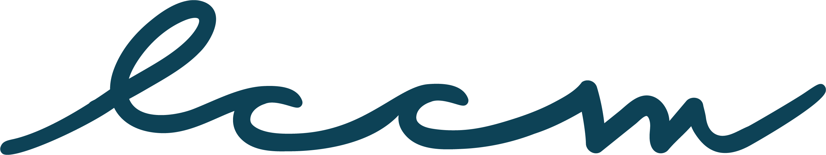
LCCM
While this doesn’t really count as an official glow up, we made a subtle change to our logo earlier this year. When Sarah first designed our logo in 2017, distressed logos were very “in” and we were happy to jump on that train. These days we prefer a cleaner look, so we quietly transitioned into using the same logo without the grunge.
After all the time, money and tough decisions it took to create your logo, we know it can be difficult to think about doing it all over again. But we hope these “glow ups” have given you an idea of what your before and after could look like. If you have questions about what the design process looks like, let us know! We’re here to help.