
If you’ve known Sarah for any length of time, you’re probably aware that she’s passionate about fonts.
It’s kind of endearing until you’re her husband and have to hear her complain every time she sees Papyrus or sloppy kerning. But seriously, why does it even matter? Can’t I just pick something from Microsoft Word and call it good? Why can’t I use a script font in all caps???
Whether you notice fonts regularly or this is the first time you’ve given them any thought, the fact is that they have a significant impact on how you perceive information. If you’re up for a long read, this article takes a deep dive into the science behind the way fonts make you feel. The long and short of it is this: Good typography elicits positive emotions and bad typography elicits negative emotions. How do you want your targeted demographic to feel?
Here are three font faux pas to avoid:
1. OVERUSED FONTS
Why it’s bad:
Let’s circle back to Papyrus. If you haven’t seen this SNL skit with Ryan Gosling (or it's sequel), do yourself a favor and give them a quick watch. Papyrus and it’s cousin Parchment can be found in abundance everywhere you go. This is partly because they manage to represent many different cultures and themes, and also because they’re available to use for free in Microsoft Word. Overused fonts aren’t inherently bad – in fact, the reason they end up being overused is because they’re often very well-designed. The problem comes when, instead of standing out from the crowd, your logo becomes one of many and people begin noticing the font instead of your business.
How to avoid it:
There are hundreds of thousands (if not millions) of fonts out there in the world besides the ones that come with Word. FontSquirrel is a great resource for guaranteed royalty-free fonts, especially if you choose one that isn’t super stylized. That being said, any font that is available to use for free is likely going to get snatched up by quite a few other people. If you want something that has a better chance of being unique, check out reputable design resources like CreativeMarket.com where you can purchase a font anywhere from $3 to $50, depending on your budget.
The exception:
Fonts used in body copy, like Times New Roman or Century Gothic. These are what we consider “the classics” and are staples in the typography world for a reason. They’re easy to read both in digital and printed form, are available on everyone’s computers and go well with a wide variety of header fonts. To be clear, these are acceptable to be used as secondary fonts, not necessarily in a logo.

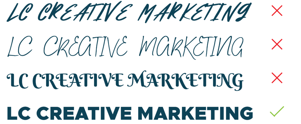
2. TOO MANY FONTS
Why it’s bad:
We rely on font weight, color and size to guide the way we take in information. If those elements are all over the place, our eyes don’t know where to go and end up jumping all over the page instead of perceiving the information the way it was intended. Using different fonts based on how you feel at the time instead of ones that align with your brand can be a serious detriment to brand recognition.
How to avoid it:
We know it can feel boring to use the same fonts over and over, but you’re going to have to take our word for it – squishing a bunch of different fonts into your marketing materials isn’t going to make things look better. Create your font rules and then stick to them no matter what. Having a resource like a brand guide is a great way to set the standard for font usage in your branding.
The exception:
Sorry, there really isn’t one. Unless your goal is to make people feel unsettled and confused, too many different fonts in one space is never a good thing.

Whether you realize it or not, fonts affect you on a daily – often hourly -- basis. Even though font science isn’t for everyone, there’s no denying that it makes a huge difference in how your audience reacts to your offerings. The good news? You don’t have to read that long article or take a course in typography. We can not only help you figure out which fonts to use for your logo and branding, but also provide you with resources to make sure your font game is always on point.
Pingback: Forbidden Fonts and What to Use Instead - LC Creative Marketing