Sarah here with another episode of "Why You Should Care About Fonts."
Font choice is a gospel I will preach for the rest of my days, and one that will make a HUGE difference in your business visuals. I would like to start by reiterating something I mentioned in my last post on this topic, and that is that the fonts I've called out below are not inherently bad. They have just been used so often for so long that they're like a song that's overplayed on the radio -- everyone is over it, and it's time for something new. Most of the time, these fonts end up being used because they're available on Microsoft Word and non-designer types don't realize how easy it is to add new fonts to your computer. Windows 10 users can find a handy tutorial here, and Mac users can find one here. I promise, it's a breeze!
To help you get started on expanding your font repertoire, I've included some alternatives to these highly-overused fonts. These are all royalty-free and can be found on FontSquirrel.com.
Ditch

Try


1. Papyrus/Bradley Hand
These two classics fall into a category I like to call Ambiguously Exotic. They're simultaneously Tuscan/Asian/earthy/alien/pirate and can be found on countless spas, sushi restaurants and wineries. I completely understand why these close cousins rose to fame in the 90s.
The great thing about these two fonts is that they can adapt to many different cultures and styles, offering an organic, foreign-looking alternative to most of the other Microsoft Word fonts. The fonts I've chosen to use instead do the same thing, but in a more subtle way. Arima Madurai Medium, Happy Monkey and Newt Serif are all easily readable and have just enough character to hint at a colorful origin.
Ditch

Try


2. Comic Sans/Marker Felt
Ahhhh, every teacher's favorite fonts! Comic Sans and Marker Felt lend themselves to anything involving children or academics and have been used in countless powerpoint presentations over the years. There's really no reason for handwritten fonts like these to be overused because there are SO MANY available.
Instead of going for these overused options, try something like Just Another Hand, SF Cartoon Hand or Solway. Each of these have loads of personality and youthful energy without being what the kid these days call "basic."
Ditch

Try


3. Jokerman
For a long time, Jokerman was the only "fun" font available in Microsoft Word, and therefore found its way into every birthday party, fiesta and toy store on the block. It's illustrated qualities made it incredibly unique at the time, which unfortunately led to its overuse.
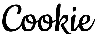
Instead of tracking down similar fonts, I found a few that are equally as fun and interesting without being quite as laughable. Cookie, Parakeet and Lifesavers Bold bring the party but leave the clown at home.
Ditch

Try


4. Impact
This old faithful font has long been a go-to for logos, flyers, and anything trying to grab attention quickly. Impact lives up to its name, but unfortunately its popularity as a flashy display font has led to overuse. I also find it to be difficult to read unless it is presented in all caps.
Instead of Impact, try fonts like Fredoka One, Kanit Extra Bold or Mitr Bold. A huge bonus of the latter two is that they come with a ton of weight options to use in other areas of your branding.
